
In the Pinterest era, everyone thinks they’re a hand letterer. Scroll through Instagram or Etsy and you’ll find thousands of homespun wooden signs and notecards with saccharine scrawls: The Smiths, Est. 2018. Live Laugh Love. Blessed. Ask any one of these upstarts what they know about the art of calligraphy – or even what it is – and you’ll likely get a blank stare.
Not so with Bernard Maisner. The renowned calligrapher and stationery designer is a lifelong disciple of his craft, an art and hand-lettering obsessive who redrew comic books as a kid and who studied centuries-old illuminated manuscripts in France. His long and storied career has included designing lettering for Barbie magazine, creating the Spiegel logo, working on myriad advertising campaigns (Nike, American Express, IBM, Macy’s, Absolut Vodka), being a calligrapher to the stars (Martha, natch) and developing his signature Maisner Script, which is considered the gold standard in the industry. He’s also created stationery for Bergdorf Goodman and is the visionary behind Valentino’s script. Somehow he also finds time to nurture his other creative passion: painting.
We chatted with Maisner about his winding career path, what makes stationery sing and why handwritten love won’t go out of style.


How did you get on this path? Why stationery and calligraphy?
My interest in hand lettering and fine art painting has been all consuming since childhood. I loved comic books and re-drew pictures and copied the lettering as a kid. As my fine art interests grew, I learned about illuminated manuscripts, themselves a marvelous joining of word and picture as well. I started teaching myself calligraphy in high school and then later as a student at The Cooper Union in New York City I was properly re-trained in the classic historical calligraphic styles by a great instructor there, who himself was a calligrapher and a painter as well. Painting and calligraphy were my passions. I started making what I call “modern illuminated manuscripts”. During the summer in 1974, while a student at Cooper Union, I studied and Illuminated Manuscripts at the Bibliothèque Nationale in Paris, France. I was given permission to sit with and study original manuscripts in the reading room, turning the pages of 500 to 1000 year old books. I particularly loved the gold illumination, miniature paintings, and the calligraphy in these masterful ancient books, and went on to teach Medieval and Renaissance Illumination years later at the Metropolitan Museum of Art, The Cloisters, The Getty Museum, and The Pierpont Morgan Library.
Upon graduating the Cooper Union College of Art in 1977, I found free lance employment doing name tags and placecards in calligraphy for the art director at Phillip Morris Inc. Within a few hours I was able to do enough work to pay the rent for my $200 per month apartment in the East Village of New York City. I did my fine art the rest of the time, exhibiting in galleries and museums. It was a great balance between business and art.
Wanting to broaden my lettering skills and offerings, and because of the wild and fine art aspect of my nature, I began doing loose and creative lettering – far from the rigid historical hands that had been the models for all calligrapher training, which was beautiful but restrictive and limited in their emotional range. I showed my loose and playful lettering to art directors at advertising agencies, record companies, magazine art directors, publishing houses, etc., and started getting jobs to create unique hand lettering for their needs. Each job was a style made just for them. I could do anything from lettering for a Lexus campaign, to lettering as the M&M characters, to being Ronald McDonald in a TV commercial, to literally being Barbie’s handwriting in Barbie magazine. I created the Spiegel logo, Whitney Houston albums, lettering for many book covers, American Express, IBM, Absolute Vodka, Macy’s, and Nike campaigns, etc. I was literally the top creative hand letterer in the United States for over 20 years. All this was before the computer and before type face fonts were available to all, and long before hand lettered looking fonts were available – or even possible to create given the technology of the day. Fortunately I was in the right place at the right time…
During the mid-1980s, things began to change. The first Apple Computer came out in 1984, and art/graphics programs rapidly grew. After programs like Fontographer were invented, people started scanning in hand lettered looking alphabets and turning them into font type faces for computers (many copied my lettering from past jobs). They were horrible looking for the most part, killing all the joy and spontaneity that real hand lettering has to offer. These fonts repeated each letter over and over instead of the seeing the adjustments and subtle variations that take place in actual hand lettering. So, this fantastic era of “creative lettering” was coming to an end. I could see the writing on the wall, so to speak. Around 1997 business was dropping off by 50% a year. After a couple of years, no matter how much I was earning, it drops down very quickly. I saw I had two choices, to go into font creation or to enter social stationery. I tried creating some fonts and hated it, all mechanical and desk work on a computer screen. I decided to offer calligraphy to stationery companies for envelope addressing. I didn’t know what else to do. It was a really sad period. I spent two years developing a calligraphic script style – I wanted to offer something very different than what every other talented calligrapher was offering. So I created a blend of the classic copperplate style and classic Spenserian styles of writing – then jazzed it up with my own stylistic preferences and edits. I hated that many calligraphers were continuing to use outmoded letter shapes that were no longer readable to the modern eye. I also was developing a very flourished aspect of unique and beautiful letter forms, and their relationship to the page – bursting off the edges. Very artistic and different, and has become a rather renowned and recognizable aspect of my brand.
The premier high-society stationery company in New York City embraced me and suddenly I had tons of work in social stationery doing envelope addressing as an associate of theirs. Soon I was asked to create lettering for invitations also. I started to learn about engraving as a printing method, and about the fine stationery field in general, something I truly knew nothing about. Joy Lewis, the owner of Mrs. John L. Strong Fine Stationery, was great and creative, and we loved working together. She displayed my calligraphy almost immediately Darcy Miller, the editor of Martha Stewart Weddings Magazine, saw my work and hired me to do her upcoming wedding calligraphy. Six months later, her wedding was profiled in Martha Stewart Weddings magazine, and just about five full pages of photography were dedicated to my calligraphy in the article. One could not ask for better exposure. Right after that I was asked to do an appearance on Martha Stewart’s television show, displaying my work and demonstrating live calligraphy writing on camera. Suddenly I was known and in demand in the social stationery field. It was so fortunate.
When the Mrs. Strongs owner retired I went into business for myself, doing all art creation as well as supervising the printing. I met clients, and became a new brand. Soon after that I was offered the opportunity to launch a line of stationery products at Bergdorf Goodman in New York City. I quickly made two years worth of work in six months – new cards designed, gift wrapping papers, I designed and produced retail boxes, manufactured many other items, did all the packaging details, etc, to be able to be ready to launch for the holiday season around the year 2000 I believe. Bergdorf Goodman had a big party for the launch and gave me a window on Fifth Avenue for the display of the new stationery line. Suddenly I was in the retail business!
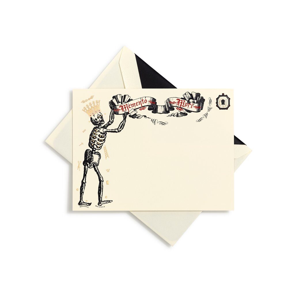
Other retail brands of stationery at the time had been gorgeous and well done, always very tasteful – and quite conservative. A small non-challenging iconographic picture would generally appear on the top, such as a seashell, a boat, a flag, etc., which was very pretty and beautifully engraved on beautiful paper. However, I felt more of that on planet Earth certainly was not needed. I wanted to elevate the artistry in stationery, making the imagery larger, more important, challenging, and edgy at times. I also felt the time had come when people were simply writing less, in great part that just thank you notes were being sent, so the large areas of blank space on a note card was just being wasted. I wanted to make it so that the card itself would be a beautiful experience and a brief message from the sender rounded it out, it became a wonderful and meaningful gift to the recipient. I also started hand painting each engraved image in boxed notecards sets. So, in a single box of butterfly cards for instance, every single card would be different and unique from the next. This had never been done before. Lots of labor, but so very special. I also made the largest sized engraved cards ever done. Very expensive and difficult to make… but I wanted to try it… Also, obviously, many items featured my very ornate and flourished calligraphy. I kept the text words quite simple for the most part, for example “Happy Holidays”, but made the words extraordinarily gorgeous, a tour de force tapestry of interwoven calligraphic letterforms, exploding up to and off the edges of the page.
What makes ‘good’ stationery?
It all comes down to excellent design. An old black-and-white copy machine print on cheap copier paper can be simply gorgeous – if it is well designed. Obviously, upgrading to thick and luscious 100% cotton papers, engraving the imagery, using many colors, and bevelling the edges in gold enhance the experience and the results, but badly designed stationery, no matter how well it may be produced or the materials used, will still be still profoundly unsatisfying.
What’s the most challenging process in creating your work?
For custom work the most challenging aspect is in the meeting with clients and talking with them, typically for 1 to 2 hours. The challenge is to try to decipher and draw out what is important to them – styles, images, and feeling – and then figuring out how to make it come to life in the stationery. It’s a very enjoyable process for all of us. I have become good friends with many clients over the years.

From a technical point of view, the most challenging aspect is to reproduce my calligraphy, in the various printing methods, is to make the very fine hairlines in the art print properly – not break up, and not get too heavy and thick looking. I obsess on the thick and thin line qualities and demand it prints properly. There are many steps along the process to go wrong – the original lettering, the scanning of the lettering into Photoshop, retouching the art, plate exposure to film, and finally etching the copper engraving die plate from the film. Each step needs to be done perfectly. Finally – the on-press printing pressure and the skill of the press person will yield a good or bad result. It is quite complex.
You developed a certain type of style of writing for Valentino, how did that come about?
Back in the advertising lettering days, the Valentino company needed lettering created for an ad campaign. They gave me actual handwritten samples from three different Italian people, and said “make it look like these but nicer”. I developed a synthesis out of the samples and they loved it. And I loved it…Years later, I offered this “Italian style” calligraphy as a sleek and sexy alternative to my classic script style calligraphy, aka “Maisnerian”, as some have referred to my lettering.
In these digital days, why is the art of the script important?
With the loss of much craft due to digital and virtual “progress”, so called “Artisanal” craft is now very appreciated as a “back to nature” feeling. Hand written calligraphy and hand written scripts fall into this category, along with cooking at home, hand made pottery, Artisanal bread – it reminds us of our need to touch and be touched, something that is becoming more and more elusive for humanity as time goes on. It is funny to me however, that the cruder some crafts are executed, the more the public perceives them as “artisanal”. Finely made “perfect” items nowadays are often not recognized as actually made by humans hands! Although there can be an element of charm to it, as in folk art, crude and untrained calligraphy is now often perceived as really artistic.
Did you see a rise/fall in sales during the lockdown?
March and April 2020 were totally dead – we were all in shock. Since then I have gotten a lot of web orders, as well as orders for custom personal writing stationery papers. As social contact has diminished, the need to communicate in this intimate way has definitely had an uptick. Of course, wedding and party Stationery has slowed down quite a bit.
Bernard Maisner: Instagram, 212-477-6776, BernardMaisner.com