


Behind the Scenes: The House of Scalamandré’s Iconic Zebra Print

The surprising origin story of the historic zebra wallpaper.
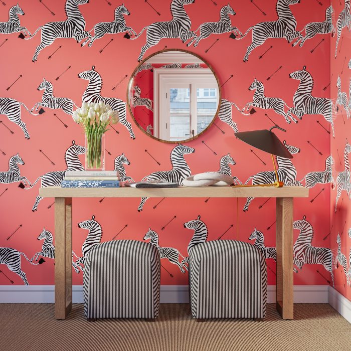
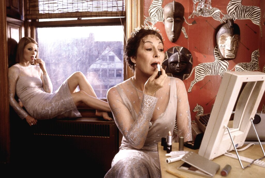
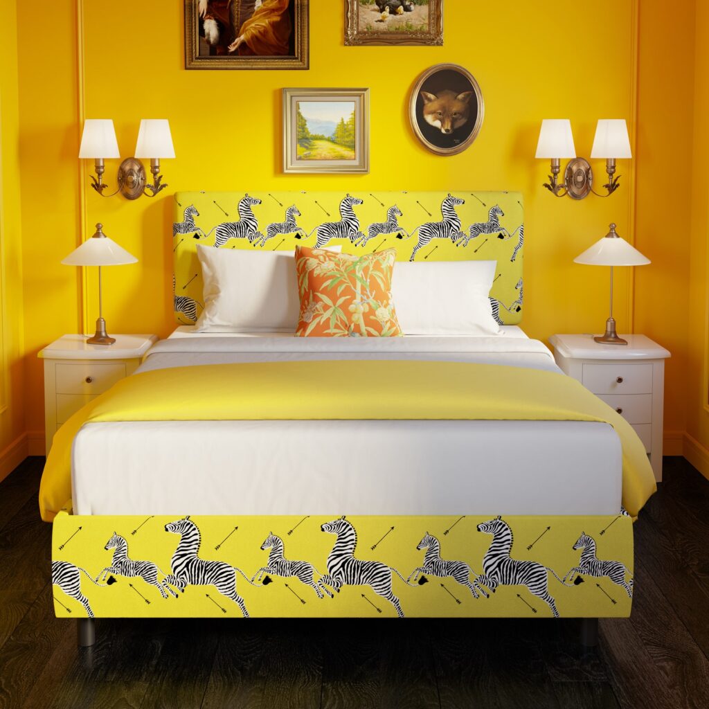
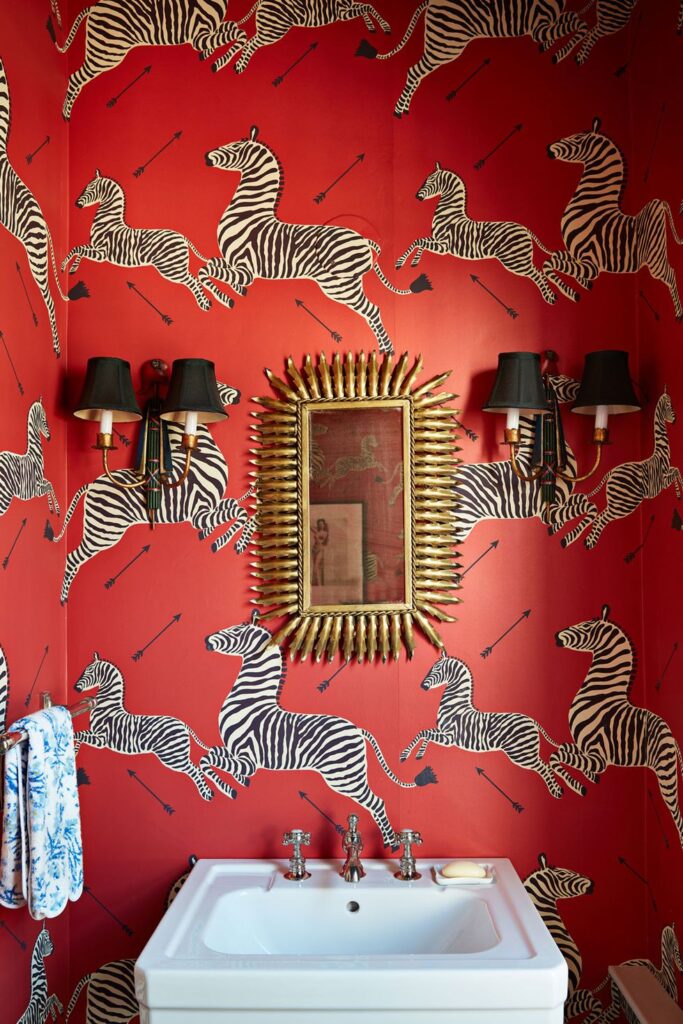
Calling someone “wallpaper” is a deliciously dismissive diss – unless that wallpaper is the zebra print by The House of Scalamandré. Being likened to the iconic animal pattern – an institution for nearly a century – would be a compliment of the highest order. The majestic yet whimsical wall covering is simple and bold: zebras leaping on a bright red background, which is also splayed with arrows. What started as wallpaper for New York City restaurant Gino of Capri has become a darling of the design community, featured in everything from House Beautiful to The Royal Tenenbaums. “You cannot plan an icon,” says Sumitra Mattai, Scalamandré’s senior design director, and there were many surprising bumps and slumps along its road to fame. Mattai chatted with us about the history and legacy of the print, including its surprising origins and modern interpretations.
I’ve read that Flora Scalamandré first designed the print for Gino of Capri – fondly known as Gino’s – in 1945. Can you talk a bit about this collaboration?
I don’t know if you’ve heard of this documentary called The Missing Ingredient? It’s actually a pretty interesting documentary. It’s, on the one hand, about Gino’s. On the other hand, it’s about this struggling restaurant in the same neighborhood… in the present day. And then [the filmmaker] interviews all these people about what was so special about Gino’s, and they go into the history of the wall covering. So I watched that to educate myself. I joined the company in January of 2018, so I am more of a newcomer.
I actually called Adriana Bitter, who is the daughter of Franco and Flora Scalamandré, and she was really sweet. I was just amazed she picked up the phone, because who picks up the phone anymore? I asked her, “What’s the deal with the zebra?” And she’s like, “Oh, I don’t even know. It wasn’t special to us.” She said the wall covering was already there at Gino’s, and so that surprised me. Her mother re-drew it and they printed it for the restaurant, and kind of never thought about it again. And I said, “So, when did you put in the collection?” And she said, “I don’t remember putting it in the collection.” I called Louis Renzo [current owner of the company, who purchased it in 2009 and merged it with Stark Fabrics in 2017] and I said, “When you bought the company, was the zebra in the collection?” He said yes, absolutely. There were four colorways, and then Lou was the one who added more colorways to it. Adriana said Lou fell in love with the zebras and started to use it everywhere.
He was the force behind its modern resurgence?
Yes. And in the documentary, it says that the original design was made by Valentino Crescenzi. Apparently, this was a friend of [owner] Gino [Circiello]’s. And the reason why it’s zebras and the reason why there are arrows in it is because Gino loved hunting. It was an Italian restaurant known for its red sauce, so I’m guessing that’s where the red came up.
There was a fire, and they redecorated and didn’t have the wallpaper anymore. All of their clients flipped out because it was a part of the culture of the place. The wall covering was a major touchstone. Apparently, [the restaurant] was this amazing cultural hub centered around this man, Gino. Anyway, that’s when they approached Scalamandré to reproduce it, because Scalamandré was known for reproductions, [especially] historic reproductions. When Scalamandré redid it, I guess the printer or the screen maker missed one of the stripes on the zebras, so there was an empty spot – where there should be a stripe, it was very obviously missing. And Gino was like, “Eh, it’s OK,” so they just put it up, and the missing stripe in the zebra butt also became a part of the history. It’s sort of the funniness of the whole thing, the specificity of it.
Was the stripe eventually added back in?
They filled in the stripe to balance it out, and now it’s really taken off. I think what I found interesting about my own research into this was that you can’t plan an icon. Adriana herself was just like, “Yeah, I don’t even like it. It was whatever to me. We just did it as a favor.” And now here it is. It’s so heavily associated with Scalamandré, and we’re not even the originators of it.
I think that’s the takeaway for me. We produce – I mean, us and so many other fabric companies – so many designs, hoping for that kind of success, dreaming of that kind of success. But you cannot plan an icon, and it’s funny because that’s actually what the documentary is about. It’s talking about what makes a restaurant an institution. What gives it sticking power? The whole thing is you can’t plan it, even with the chef of the moment, the architect of the moment, whatever. You can put the pieces together, but only time and your audience will let you know if it’s an institution. And I think it’s the same with design.
You have riffed on the classic with your own design, right?
In our recent introductions, I did this leaping cheetah design. I knew that I could never touch or top the zebra, but I sort of took the same formula of an animal on a solid background. I did it as a digital print so we could do whatever color we wanted. For me as a designer, I want to move forward. So, part of me is – if I’m being perfectly honest – sort of like, “Enough already with the freaking zebras.” At the same time, every time I see them, I’m like, “There we are!” Even if somebody doesn’t know the name Scalamandré, chances are they would see the zebra and it would have some kind of meaning for them, whether they saw Royal Tenenbaums or saw it somewhere else. I do feel that it lives a bit apart from the rest of our collection, which has moved with the times and is more of the moment. The zebra is sort of on its own. But it’s an easy win, is what it is. And that’s why I think Lou continues to encourage us to perpetuate its life, because it’s such a signature, and you just can’t buy that.
My colleague said she thinks part of it is that it’s a mother and child zebra, which I don’t think crossed my mind at all. It just was big and small [zebras], and I never thought about it as a family or anything. But to her, she felt that that was a subconscious meaning.
And of course zebras themselves are so striking, with the contrast of black and white.
Just the fact that it’s graphic – black, white and red. Who can forget that? It hits you on a kind of gut human level, that color combo. I think there’s something about that, even though we do it in other colors. And not everybody wants red wallpaper in their houses – that’s a pretty bold choice. But the original has that something special to it that you can’t forget.

How can admirers experience the print these days? I know it’s moved beyond wallpaper.
Scalamandré currently sells 12 colorways of the zebras wall covering, which is handprinted in New York state, plus three versions printed on a textured grasscloth and paperweave. We also sell three colorways of the zebras as a fabric print on a cotton/linen blend, and three colorways as an outdoor print. Louis Renzo has produced limited-edition umbrellas and other objects. I know they also did a collaboration with Lenox china years back.
Recently, we collaborated with The Inside, a furniture startup. It’s a direct-to-consumer brand and their main thing is prints, so you can choose any pattern you want on any frame, and it’s made to order at a price point. They approached Scalamandré to re-color some of our archival designs and to do some exclusive colorways with them, which we did of the zebra. We’re a 90-year old company, and we really want to stay connected and stay relevant. How do we let a new generation know about Scalamandré? Well, the zebra is a perfect vehicle for that. You could get a more contemporary piece of furniture with the zebras on it at a [lower] price point, and maybe you’ll grow into the high-end looks, the hand-printed original version. That’s the hope, is that we’re introducing our brand to the next generation and to millennials who may not be aware of us.
As a design professional, what has been your experience with the company, you know, getting comfortable with the brand and then feeling confident to put your stamp on it with your own interpretations?
I’m not a traditionalist at heart. My gravitational pull is sort of toward a more modern aesthetic. But I love the idea of the challenge of taking on this kind of heritage brand. It’s an opportunity. I mean, who wouldn’t be interested in that as a challenge as a designer? I’ve learned so much from everyone in the company, for sure, and a lot about myself. I find my own tastes changing and evolving, just by virtue of being around this sort of aesthetic that, like I said, isn’t my second nature. But I’ve come to really love and appreciate the sort of “more is more,” the layering, the prints. I don’t have any zebras in my house yet, but never say never.
(This interview has been edited for length and clarity)
